
Electrical Contractor License no. DELPHOC773DG
5348 216th Ave SW
Centralia, WA 98531
(360) 349-6910
 Clients please login
|
Electrical Contractor License no. DELPHOC773DG |
Call now:(360) 349-6910 |
5348 216th Ave SW Centralia, WA 98531 (360) 349-6910 |
Clients please login
|

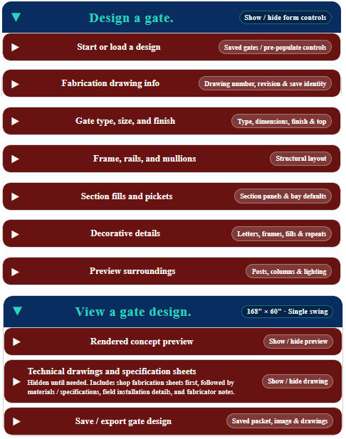
This page moves from a rough idea toward a saved gate design packet. It now has three distinct working areas: Design a gate for the fabricated moving gate, Gate System Designer for installed surroundings and equipment, and View a gate design for review, drawings, bids, saving, and export.
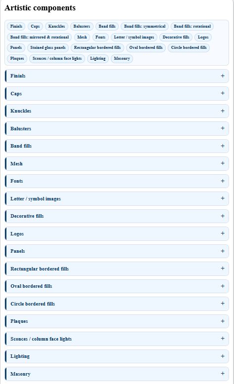
The Gate Designer includes a growing library of artistic components used in many different parts of a design. These include finials, caps, knuckles, balusters, band fills, mesh, fonts, letter and symbol images, decorative fills, logos, panels, bordered fills, plaques, sconces, lighting, and masonry.
Some components are chosen as structural or fill options, while others are added as decorative details or installed Gate System equipment. Logged-in subscribers may also see components from their own catalog in supported system selectors.
Many Gate Designer sections have their own apply button. This lets the page rebuild the next related controls in a top-down order without forcing the user to save the whole design after every small adjustment.


This first walk-through follows the default starter gate through the Design a gate controls. The goal is to help a new user understand what the default design already contains before changing many options.
The default design is a simple single-swing gate with enough structure to discuss automation attachment, rail placement, fabrication, and customer-facing proportions.
Use it as a neutral starting idea, then adjust the type, size, rails, pickets, fills, and drawings below.
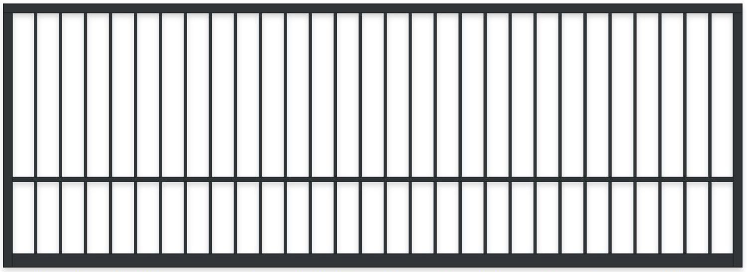
The default starter gate is a 14' x 5' single-swing gate. In Gate type, size, and finish, the opening width, gate height, gate type, finish color, and top style are the first settings to understand.
Later help sections can show expanded selectors and alternate choices.
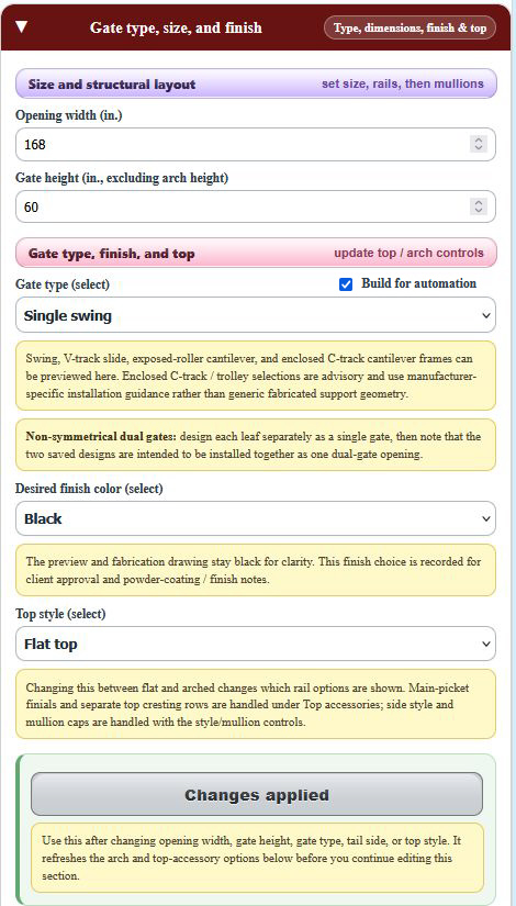
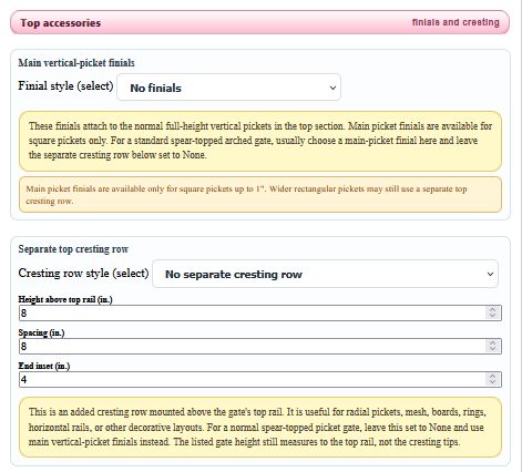
The default gate does not need finials or a cresting row. This keeps the first design clean and makes it easier to understand the frame, rails, and pickets before adding ornamental parts.
Finials, cresting rows, and other top accessories are better explored after the user understands the base gate.
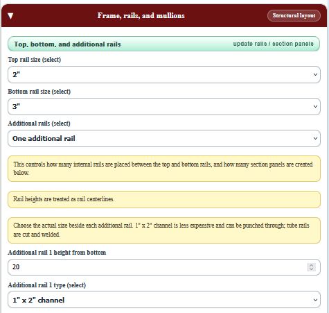
This is the next design area after the top-accessory settings. The default gate uses a simple frame with top and bottom rails plus one additional rail.
Rails divide the gate from top to bottom into sections. These structural choices should be understood before working on section fills, pickets, mesh, boards, or custom bay details.
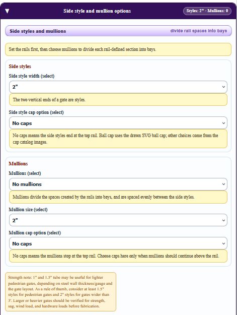
The default gate uses side styles at the left and right ends, with no extra mullions. That means the rail layout creates the main sections, while the width is not divided into extra bays yet.
Adding mullions later divides sections left-to-right into separate bays.
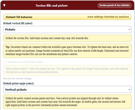
The default fill is pickets. This is the simplest way to see how the gate is divided by rails and how the open spaces are filled before trying boards, mesh, decorative fills, or custom bays.
Section-level settings become the starting behavior for each new section and bay.
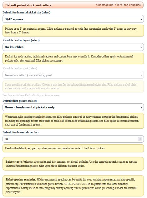
The starter design uses plain square pickets, no knuckles, and a default picket count. These settings affect the look, material, cost, and opening spacing of the gate.
This is where the user begins to see the difference between a structural default and more decorative options.
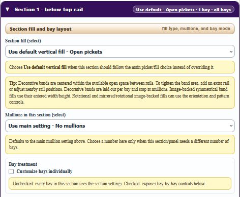
After the default picket stock is set, the designer shows the section panels created by the rails. Section 1 is the area below the top rail.
For the default starter gate, this section uses the main vertical-fill setting: open pickets, no added mullions, and no bay-by-bay customization.
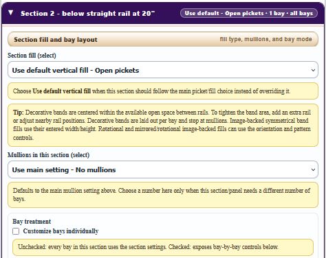
Section 2 is below the straight rail at 20" on the default starter gate. It also begins by using the default open-picket fill.
This gives the user a simple example of how each section can start the same, while later designs can make the upper and lower sections different.
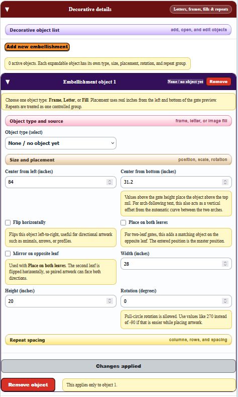
The default starter gate has no active decorative objects. This is intentional. It keeps the first design focused on the structural gate before letters, frames, image fills, repeats, plaques, or ornamental objects are added.
Use Add new embellishment when the design is ready for a decorative object.
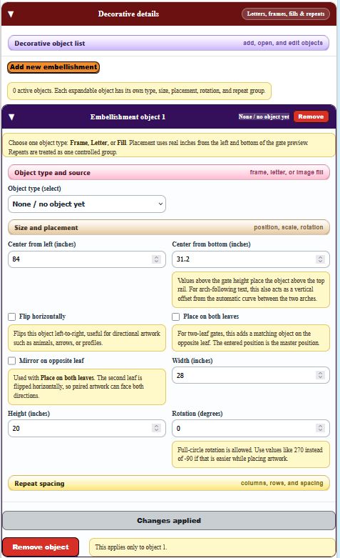
When an embellishment is available, its accordion contains the object type, source, size, placement, rotation, mirroring, both-leaf placement, and repeat spacing controls.
For the default tour, this area is mainly a preview of where future decorative settings will be handled. Later help sections can show real examples with lettering, frames, image fills, plaques, and repeated objects.
After the gate itself is understood, open the separate Gate System Designer. Its first subsection handles posts, columns, structural slide supports, masonry, lighting, plaques, and post tops.
The second subsection handles photo-eyes, KNOX boxes, fire-strobe detectors, and magnetic locks. Some items are client-facing context; others are installed-system hardware shown in elevations, plan views, or supplemental sheets rather than on the gate fabrication sheet.
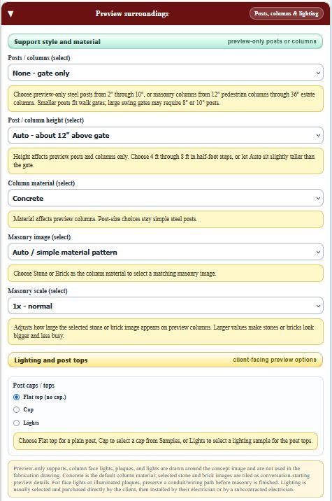
Use this first tour to learn what the plain starter gate contains inside Design a gate, then recognize where the separate Gate System Designer begins.
Later help sections show alternate gate types, arches, custom bays, decorative fills, movement and handing, posts, columns, lighting, safety devices, emergency access, locks, and saved gate-only units.
This second walk-through starts where the Gate Designer changes from editing choices to reviewing the result. It follows the View a gate design area for the same default starter gate.
The rendered concept area provides an outside / street / ingress elevation and a mirrored inside / property elevation. Together they show the selected hinge side, swing direction, support faces, and the visible side of installed equipment.
The summary boxes below the preview help verify frame sizes, mullions, pickets, rails, sections, fills, calculated spacing, and warnings before moving on to the plan view, technical drawings, or saved packets.
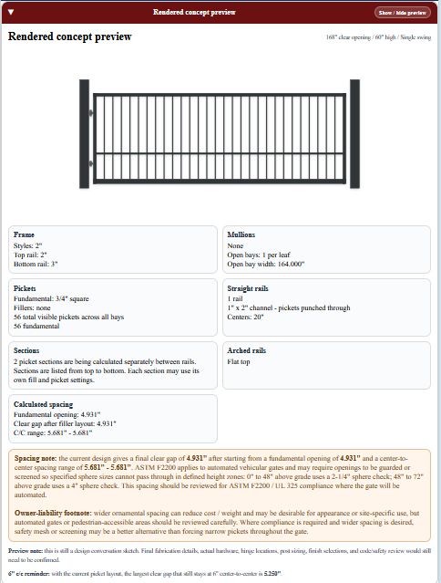
The two concept elevations are the quick visual check. They show the installed gate from each side but do not attempt to show full perspective depth.
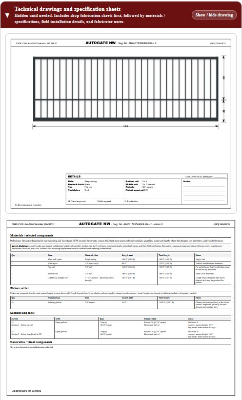
The technical packet turns the same gate into printable documentation: the gate-only fabrication drawing, materials and selected components, hinge or slide-support details, proportional plan view, installation references, and other production information appropriate to the selected gate type.
This is the conclusion of the default-gate tour. After reviewing the concept and drawings, save the simple starter design before making a more complex version.
Use Download design JSON for a local re-entry file, the print / PDF buttons for drawings, Save Gate Design Packet for the complete design and system, or—when logged in as staff or a subscriber—Save gate only for an eligible single-swing gate unit.
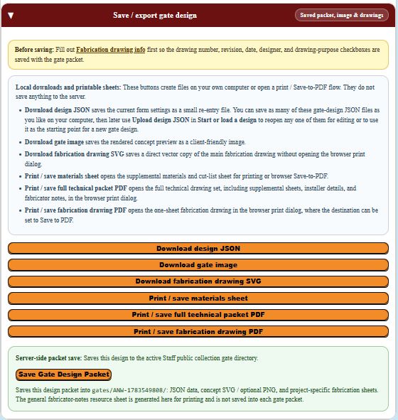
Local design files: Use Download design JSON to keep a design file on your own computer. Use Upload design JSON in Start or load a design to bring that file back into the designer later. Imported files are loaded as unsaved designs and are checked before their settings are accepted.
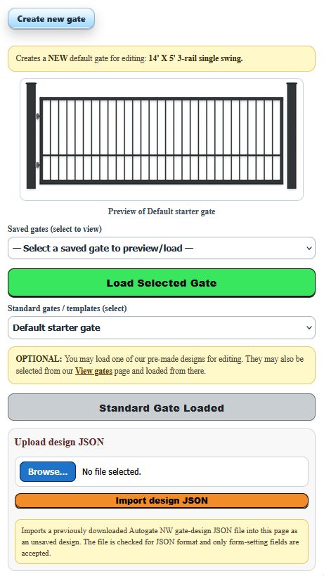
This is the first stop in the design workflow. Work from top to bottom: start fresh, load a saved design, choose a standard gate, or import a local design JSON file.
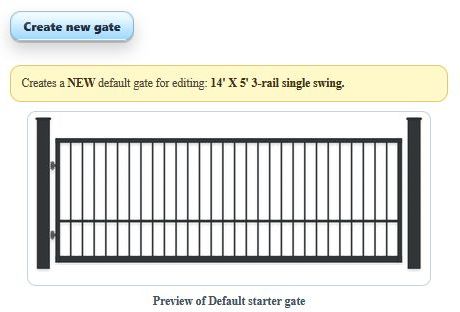
Use Create new gate when you want to clear the current working design and return to the standard starter gate.
The starter gate gives you a known, simple 14' x 5' three-rail single-swing design to begin editing.
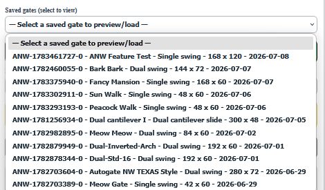
Open the saved-gates selector to preview and load a design that has already been saved to the account collection.
The list identifies each design by its ANW drawing number and may also show the project name, gate type, size, and date, making it easier to find the correct gate before loading it.
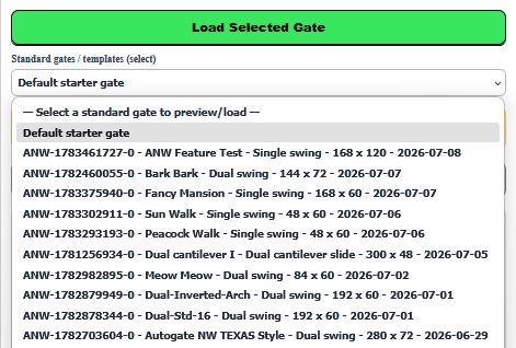
Standard gates are pre-made starting points. They can be loaded for editing when you want something more specific than the plain default starter gate.
These designs may also be selected from the View gates page and brought back into the Gate Designer for modification.
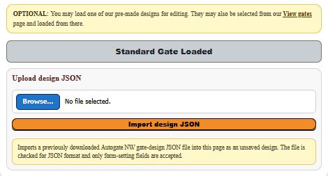
Use Upload design JSON to reopen a gate-design file that was previously downloaded to your own computer.
The imported file is checked for valid JSON format, and only recognized Gate Designer form settings are accepted. It opens as an unsaved working design, so save it again when you want it kept in the account collection.
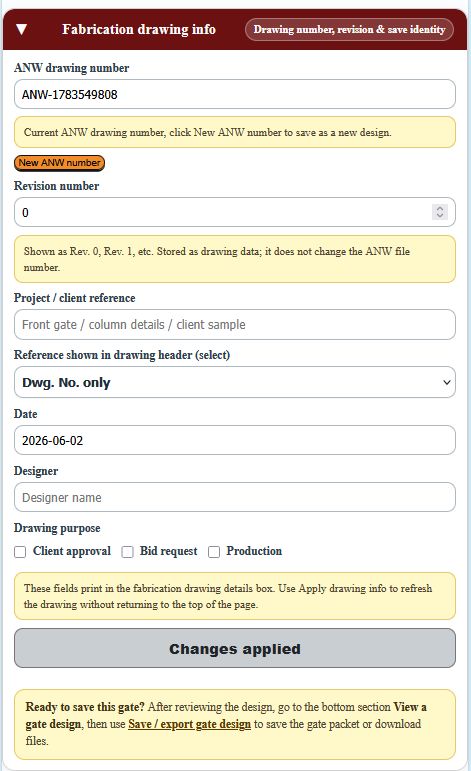
This area comes immediately after Start or load a design. Use it to identify the gate drawing before serious saving, printing, or export.
Use the drawing number, revision, project reference, date, designer, and purpose information to identify the packet clearly.
This is especially important when the same gate has multiple revisions or when drawings move from client approval to bid request or production.
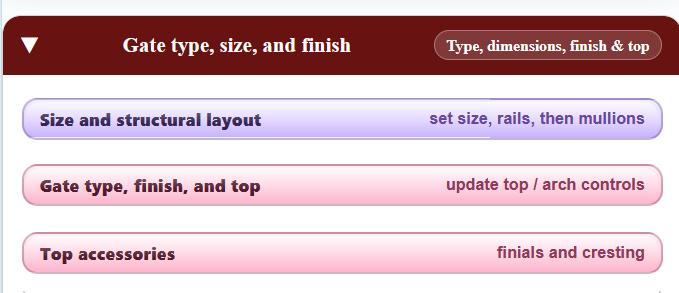
This section sets the gate's basic identity. Work from top to bottom: first set the opening width and gate height, then choose the gate type and finish. Changing the gate type can reveal different controls farther down the page, so it is best to establish these choices before working on fine details.
Section navigation view. This compact overview shows the top-down order of the main control groups in Gate type, size, and finish: size and structural layout, gate type / finish / top, and top accessories.
Opening width records the clear opening the gate is intended to cover.
Gate height sets the main gate height, excluding added arch rise where applicable.
Gate type determines whether the design swings, slides on V-track, uses exposed cantilever rollers, or follows one of the enclosed C-track advisory layouts.
Desired finish color is recorded with the design and can be used for customer approval and finish notes.
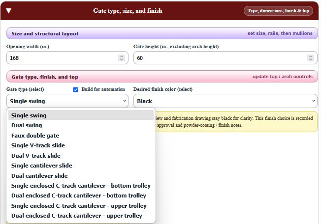
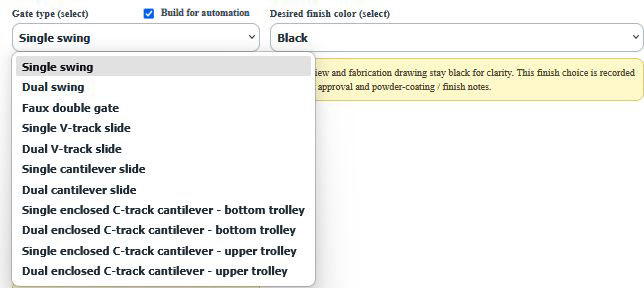
The gate-type selector contains the main operating layouts supported by the designer.
Some choices are ordinary fabrication layouts, while the enclosed C-track / trolley choices are advisory and may depend on manufacturer-specific hardware and installation guidance.
The visual guide below explains each choice individually and leaves room for a matching gate illustration.
Swing in opens toward the property. Swing out opens toward the street or approach side. The direction is always read while facing the closed gate from outside / street.
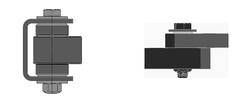
Hinged left or Hinged right is also read from outside / street. The selected CI3000 hinge artwork appears on that side in the elevations and swing installer detail.
The selected tail side identifies which way a single slide gate opens. Additional Gate System controls place the gate plane and guide or carrier posts on the outside or inside side of the opening.
Handing and movement affect hinges, lock location, support faces, safety-device placement, and the plan-view movement envelope. Left and right gate-only units should therefore be saved as separate records.
The 11 gate types are organized below by the way the gate is physically supported and moved. Each support category is introduced first, followed by the single, dual, or special versions that use it.
Hinges support the gate between the gate style and the post, allowing the leaf to pivot open and closed.
This category includes single swing, dual swing, and faux double gates. A faux double is still one physical hinged leaf; it is simply styled to look like a pair.
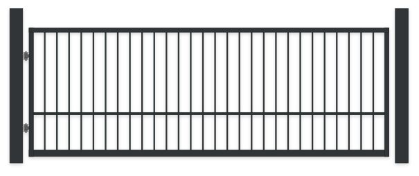
A single swing gate is one moving leaf hinged at either the left or right side of the opening.
It is simple to understand and fabricate, but wider or heavier leaves need careful attention to post strength, hinges, sag, wind load, operator selection, and the available swing area.
A dual swing gate divides the opening between two hinged leaves, usually meeting at the center.
Each leaf is shorter and lighter than one full-width leaf, which can reduce hinge loading and make wider openings easier to support and automate.
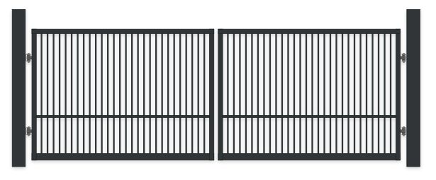
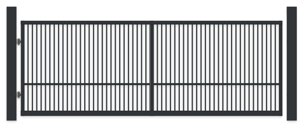
A faux double gate is one moving leaf styled to resemble two gate leaves, usually by using a centered visual division or mirrored design.
This can give the balanced appearance of a dual gate while retaining a single moving assembly.
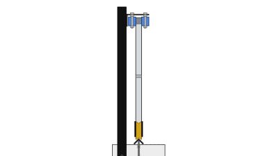
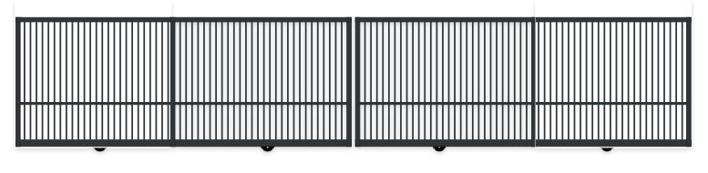
Wheels beneath the gate ride on V-shaped track fixed to the ground, carrying the gate sideways across and away from the opening.
This category includes single and dual V-track slide gates. The track, wheel housings, guide rollers, side room, and site conditions all affect the final layout.
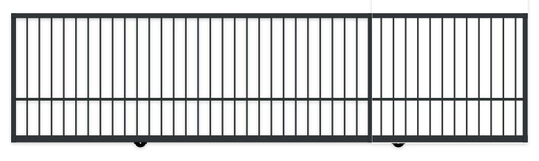
A single V-track slide gate moves horizontally on wheels that follow a V-track installed across the driveway and into the gate's open position.
It needs side room for the gate and tail, a suitable track foundation, guide rollers, and regular attention to debris, snow, or other conditions that may affect the track.
A dual V-track slide gate uses two rolling leaves, normally meeting at the center and opening in opposite directions.
It can reduce the side room required on either one side, but it doubles many of the moving, guiding, track, and operator considerations.
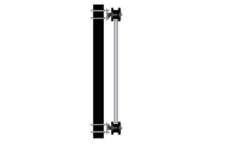
Cantilever rollers support the gate beside the opening so the gate spans the driveway without ground track across the travel path.
A counterbalance tail is structurally required. The rollers, support posts, foundations, tail length, and side room are essential parts of the system.
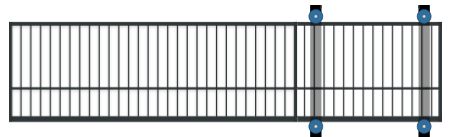
A single cantilever slide gate is supported by rollers and a counterbalance tail so the moving gate spans the driveway without a track across the opening.
It needs enough side room for both the clear-opening section and the tail, along with strong support posts, properly placed rollers, and adequate foundation work.
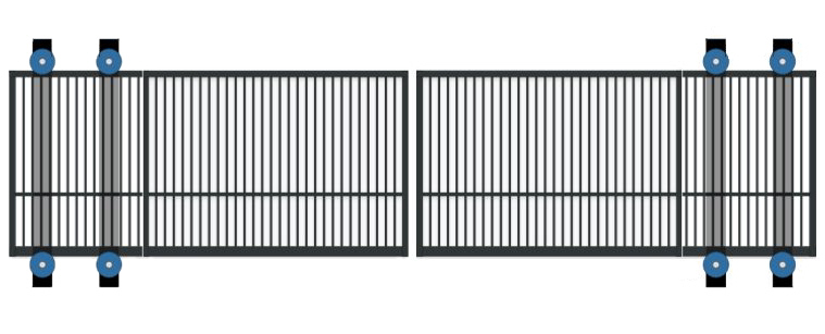
A dual cantilever gate uses two separate counterbalanced leaves that move toward or away from the center of the opening.
This can divide the required storage distance between both sides of a wide opening, but each side still needs its own tail, support system, foundation, and movement clearance.
A lower trolley or truck supports the gate through an enclosed C-track arrangement beneath or along the lower portion of the gate.
These are advisory layouts because the rail profile, trolley spacing, service access, drainage, contamination protection, and load limits depend on the chosen manufacturer and hardware system.
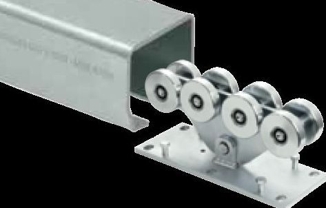
This advisory layout represents a single sliding gate supported by a lower enclosed C-track / trolley arrangement.
Hardware dimensions, truck spacing, rail profile, service access, drainage, contamination protection, and installation requirements should follow the chosen manufacturer's system rather than a generic fabricated detail.
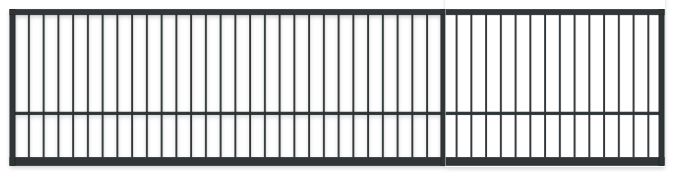
This advisory layout uses two opposing sliding leaves, each relying on a lower enclosed C-track / trolley system.
Because the hardware is manufacturer-specific, the Gate Designer should be used for concept planning and layout communication, not as a substitute for the selected system's engineering and installation instructions.
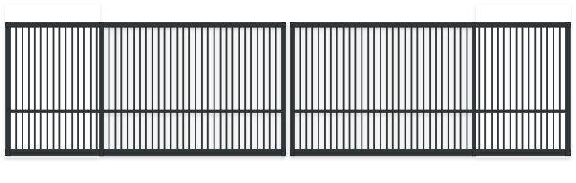
An upper or side-mounted trolley system supports the moving gate through enclosed track beside or above the gate.
These are also advisory layouts. Final rail position, truck design, lower guidance, service access, thermal movement, and attachment details should follow the selected manufacturer system.
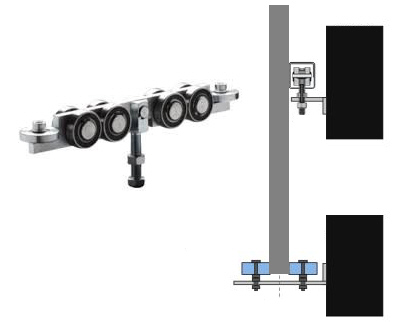
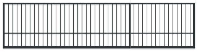
This advisory layout represents a single sliding gate using an upper or side-supported enclosed C-track / trolley arrangement.
Actual rail location, truck design, lower guidance, service access, thermal movement, contamination protection, and attachment details are system-specific and should follow manufacturer guidance.
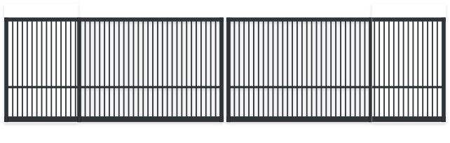
This advisory layout uses two sliding leaves meeting at the center, with each leaf supported by an upper or side-mounted enclosed C-track / trolley system.
The final arrangement should be based on the actual manufacturer hardware, loading limits, support geometry, guides, service clearances, and installation requirements.
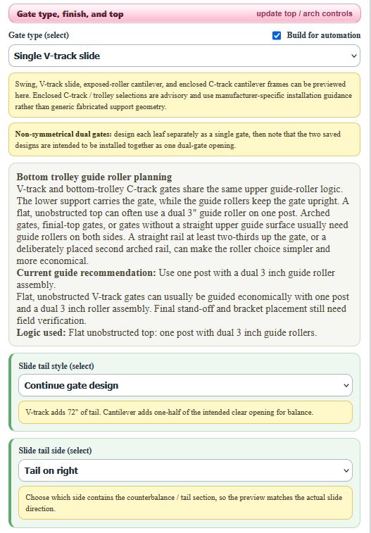
These controls are common to the non-swing gate families. They determine whether the design is being planned for automation, how the added tail section is treated, and which side of the opening contains that tail.
After choosing a non-swing gate type, the Gate Designer reveals related planning controls. These include the Build for automation checkbox, guide-roller guidance where applicable, the Slide tail style selector, and the Slide tail side selector.
The screenshots below use a V-track gate as the example, but the same general tail-style and tail-side choices are used for the non-swing gate families. The exact structural need for a tail differs by support system.
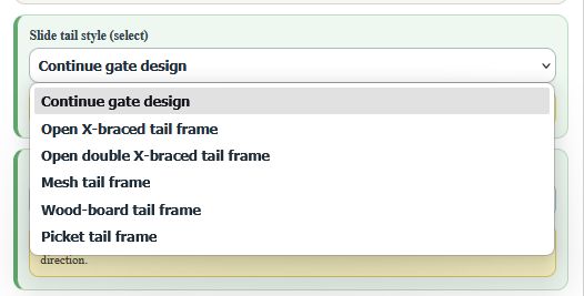
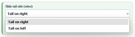
Each dropdown choice below now has a reserved illustration area. The image can be added later without changing the Help structure.
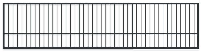
The tail continues the same general visual treatment as the main gate.
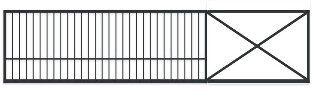
An open tail section reinforced with a single X-braced frame.
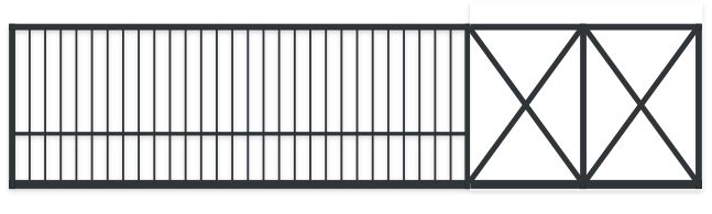
An open tail frame using two X-braced areas for a longer or more divided tail.
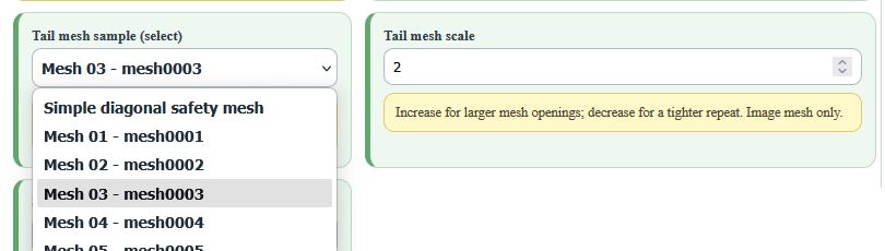
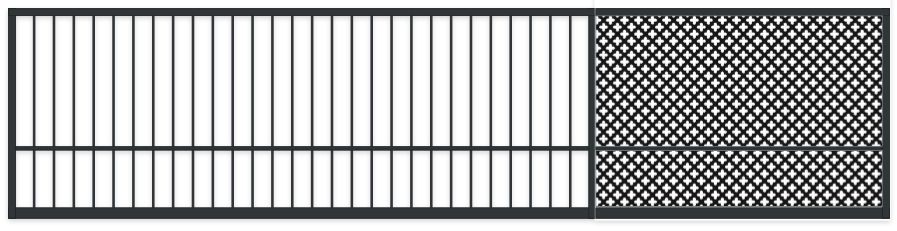
The tail section is visually filled with mesh, as shown in the gate illustration.
The separate controls image shows that the user can choose a tail mesh sample and adjust the tail mesh scale to make the openings larger or the repeat tighter.
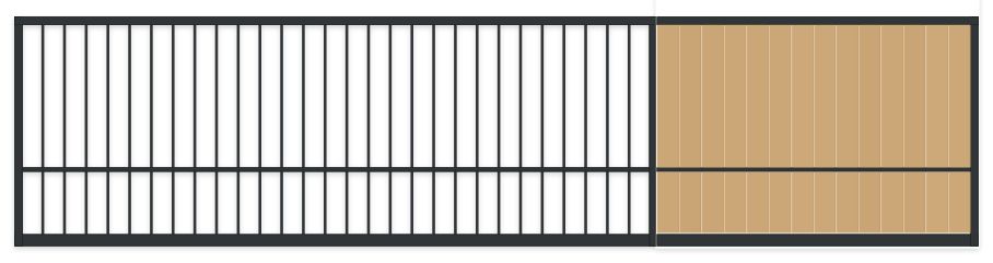
The tail section uses boards to continue or complement a boarded gate design.
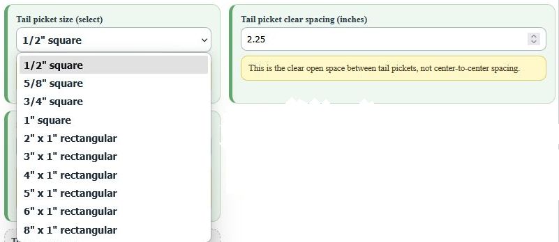
The tail section uses pickets rather than remaining completely open, as shown in the gate illustration.
The separate controls image shows that the user can choose the tail picket size and set the desired clear spacing between tail pickets.
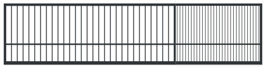
The tail is drawn on the right side so the preview matches a gate that stores and opens in that direction.
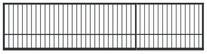
The tail is drawn on the left side so the preview matches a gate that stores and opens in that direction.
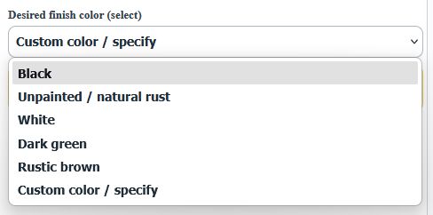
Choose the intended gate finish from the selector, or use Custom color / specify when a different color or finish needs to be recorded.
The preview and fabrication drawing stay black for clarity. This finish choice is recorded for client approval and powder-coating / finish notes.
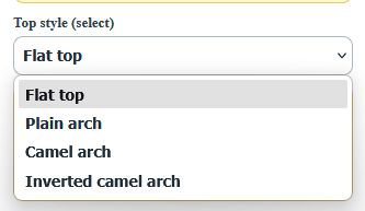
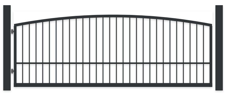
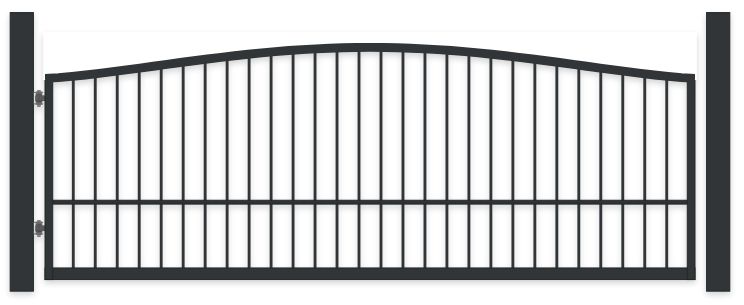
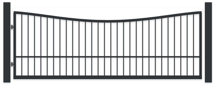
The Top style selector changes the shape of the top of the gate. The choices currently include Flat top, Plain arch, Camel arch, and Inverted camel arch.
Flat top keeps the upper gate line straight.
The three arch choices change the upper frame geometry and may reveal additional arch-rise or related controls farther down the section.
Work from top to bottom and apply the top / arch choice before continuing so later controls can rebuild correctly.
The illustration spaces below are ready for the next images in sequence as they are added.
A single continuous arch rises toward the center of the gate.
A double-rising top shape creates a higher center section between two curved shoulders.
The center dips below the outer shoulders, creating the inverted form of the camel arch.
Arch rise controls how far the selected top arch rises above its lower reference point.
This is the first additional setting to review after choosing an arched top. Individual leaf tops may be limited in the preview according to the available single-leaf width so the drawing does not become misleading or awkward.
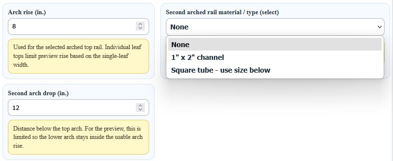
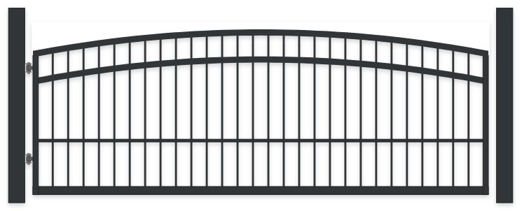
An optional second arched rail can be added below the main top arch.
Choose its material / type, then set the second arch drop to control the distance below the upper arch.
One example is enough to show the result: the space between the two curved rails creates a clear decorative band across the upper portion of the gate.
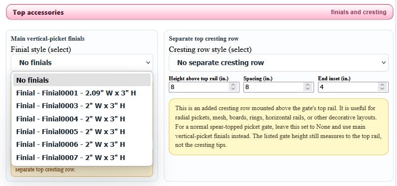
Main vertical-picket finials are placed on the tops of the gate's main vertical pickets. Choose No finials for a plain top, or select an available finial style from the component library.
On an arched gate, the finials follow the arched top line of the pickets.
4. Add a separate top cresting row when wantedA separate top cresting row is an independent decorative row mounted above the gate's top rail.
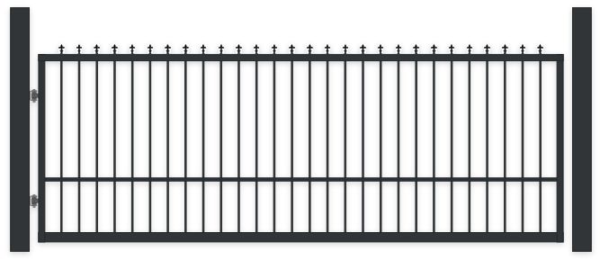
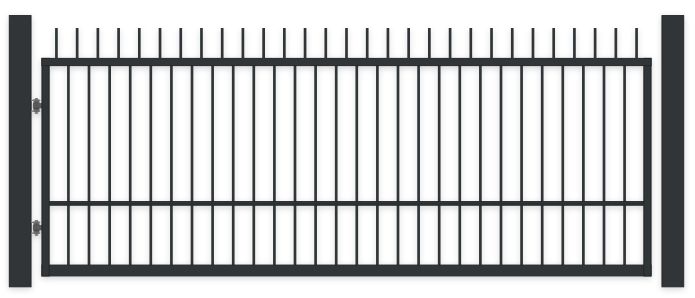
Finials are attached to the tops of the gate's main vertical pickets. No separate cresting row is used in this example.
A separate cresting row is added above the top rail while the cresting pickets themselves remain plain.
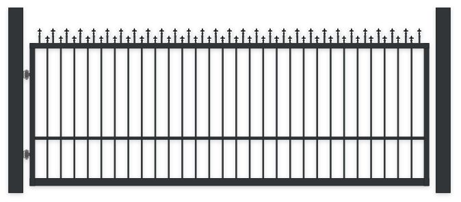
Finials can be used on the main vertical pickets and also on the separate cresting row, creating two ornamental levels above the gate.
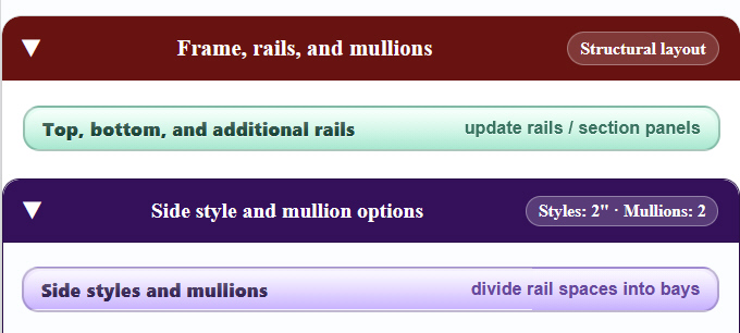
Set the structural layout before choosing section fills. Begin with the outside frame and horizontal rails, then add mullions when left-to-right bay divisions are needed.
Section navigation view. This compact overview shows the structural order here: first Top, bottom, and additional rails, then Side styles and mullions to divide rail spaces into bays.
The top rail size and bottom rail size are selected first. These two rails form the upper and lower horizontal boundaries of the gate frame.
Then choose how many additional rails are needed and set each additional rail's height from the bottom and its material / type.
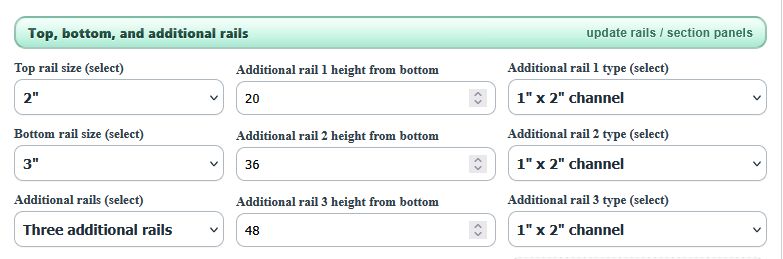
This example shows a gate with three additional rails between the top and bottom rails.
Each added rail divides the gate into another horizontal section. The Gate Designer allows up to eight additional rails when a design needs more stacked sections.
The height and material / type of each additional rail can be set separately.
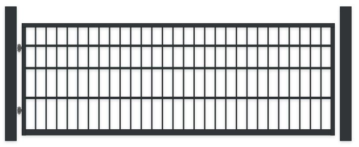
After the horizontal rail layout is set, mullions can divide the gate from left to right. The Gate Designer allows up to five mullions.
These mullions are first applied as a global layout across the gate. Later, individual sections can be changed so a particular section can use a different mullion arrangement when the design calls for it.
This example uses two mullions across a gate that already has four horizontal sections.
Important: The number of pickets previously selected now applies to each bay. After adding mullions, the picket count may therefore need to be reduced or otherwise adjusted.
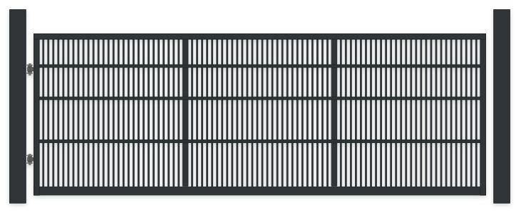
Think of the layout in two passes. First, work top to bottom: the rails divide the gate into stacked sections. Then work left to right inside each section: the mullions divide that section into bays.
Once the frame, rails, mullions, sections, and bays are established, this area controls what fills those spaces. The easiest way to understand it is to work from broad defaults toward more specific overrides: default fill behavior → section choices → individual bay choices.
Section navigation view. This overview shows the layered order inside Section fills and pickets: start with the defaults, then move into a section, and only then open a bay when a more specific override is needed.
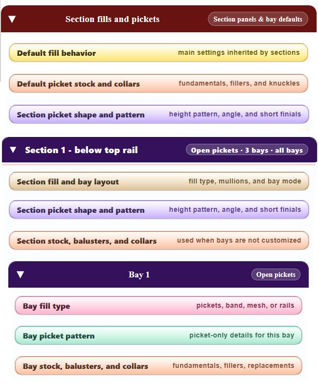
The default settings provide the starting behavior for sections and bays. They can later be changed at the section level or, when needed, for an individual bay.
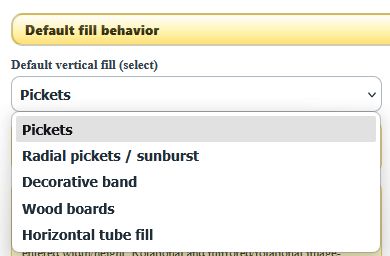
The default fill can begin with pickets, radial pickets / sunburst, decorative band, wood boards, or horizontal tube fill.
This is the starting choice inherited by the sections and bays unless a more specific setting replaces it later.
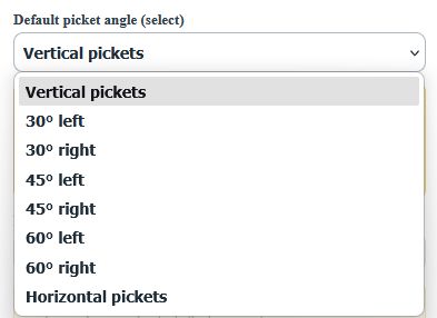
Pickets may remain vertical or be angled left or right at several preset angles. A horizontal-picket option is also available.
This choice becomes the default picket direction for sections and bays using the main picket fill.
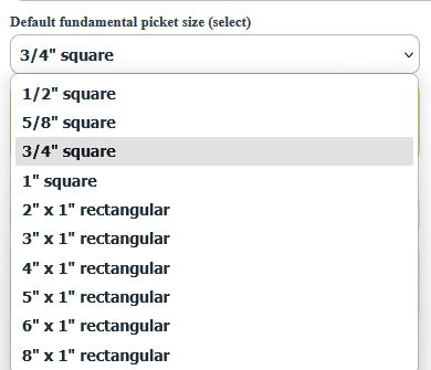
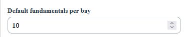
The fundamental pickets are the main repeating pickets in the bay. Choose from square tube or the available rectangular tube sizes.
The size selected here becomes the default stock size for the main pickets unless a section or individual bay later changes it.
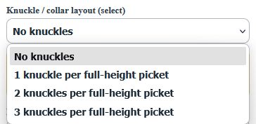
The default knuckle / collar layout can remain plain or place one, two, or three decorative knuckles on each full-height picket.
More detailed collar and knuckle choices may appear later when a particular section or bay is customized.
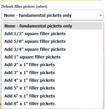
Filler pickets are smaller or secondary pickets placed between the fundamental pickets.
They can reduce clear openings, change the visual rhythm, or create a denser pattern without replacing the main fundamental-picket layout.
The selected number of fundamental pickets applies to each bay, not to the entire gate width.
After mullions create more bays, this number often needs to be reduced so the spacing and proportions remain practical.
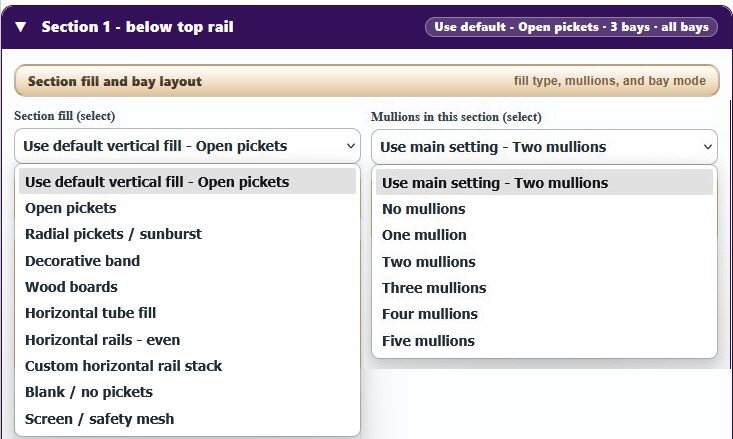
Each horizontal section can inherit the defaults or use its own fill and mullion arrangement.
A section may use the default vertical fill or change to another available fill such as open pickets, radial pickets, decorative band, wood boards, horizontal tube fill, horizontal rails, blank space, or screen / safety mesh.
The same section can also inherit the main mullion setting or use a different number of mullions.
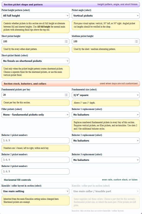
These controls are for changing one section away from the global default.
3, 6, 9.Picket numbers are 1-based and counted left to right within each bay.
When a section remains set to Use default vertical fill — Open pickets, these section-specific controls stay ghosted because the section is inheriting the global default unchanged.
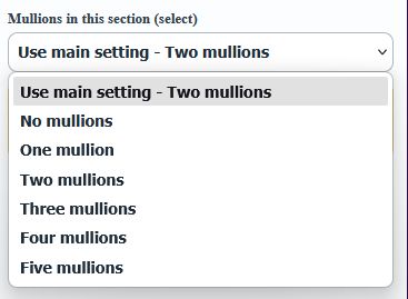
The global mullion layout is only the starting point. A particular section may use no mullions or anywhere from one through five mullions.
This allows upper and lower portions of the same gate to have different bay divisions.
When all bays in a section should match, leave the section at its shared settings. When one or more bays need to differ, turn on individual bay customization.
Check Customize bays individually only when one or more bays need different treatment from the rest of the section.
This reveals a separate control accordion for each bay.

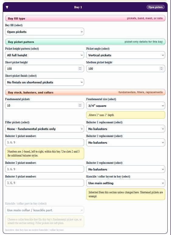
Once individual bay customization is enabled, each bay receives its own controls. A bay can have its own fill type, picket height pattern, picket angle, fundamental-picket count and size, filler pickets, baluster replacements, knuckle / collar layout, and related details.
This is the most specific level of control: defaults establish the starting behavior, sections can override the defaults, and an individual bay can override its section.
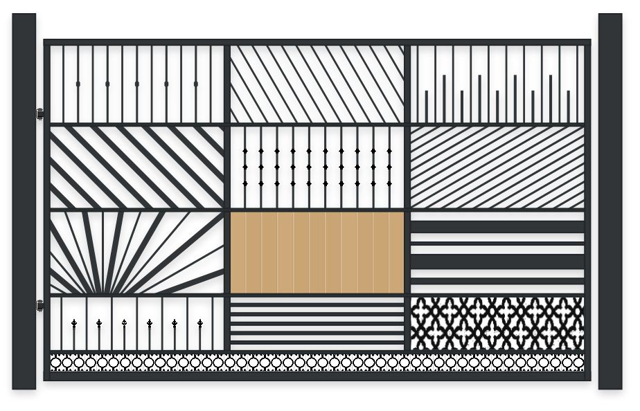
This deliberately busy 16' wide × 10' high gate uses four additional rails to create five horizontal sections. The upper four sections use two mullions, creating three bays each; the lowest section removes the mullions and spans the full width.
Use this section for visual and ornamental details added to the gate itself. Decorative objects are created one at a time, and each object keeps its own type, size, placement, rotation, mirroring, both-leaf placement, and repeat settings.
Section navigation view. Decorative details begin with the object list and Add new embellishment. Each object then opens its own grouped controls for type, placement, and repeat behavior.
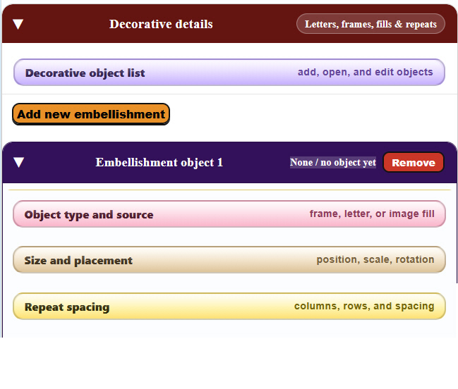
Click Add new embellishment to create a new embellishment object.
Each object receives its own expandable accordion, where its type, size, placement, rotation, mirroring, both-leaf placement, and repeat settings can be adjusted.
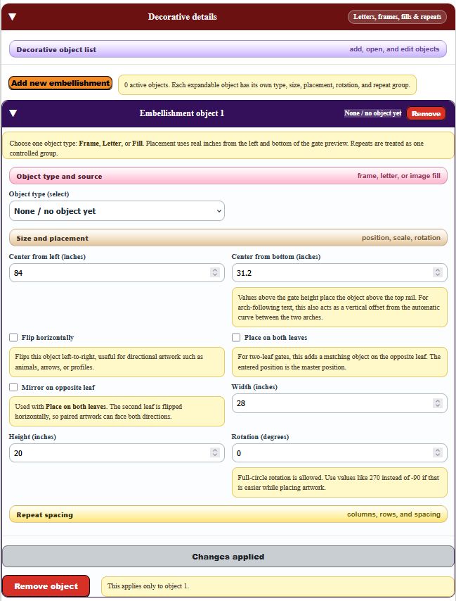
Then choose:
Then set the position from the left and from the bottom of the gate.
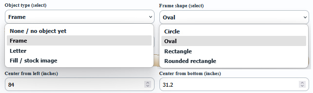
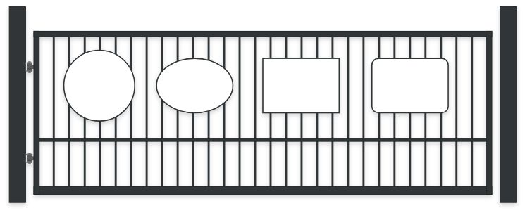
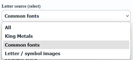
Then choose a letter source:
After choosing the source, select the font or image style and enter the desired text.
Ordinary keyboard text can be entered directly.
Use Insert character to add supported UTF-8 characters and symbols, including accented letters, punctuation, fractions, business symbols, stars, arrows, Greek letters, mathematical symbols, Roman numerals, hearts, music symbols, and other simple marks.
The chosen font must contain the character for it to preview and cut correctly.
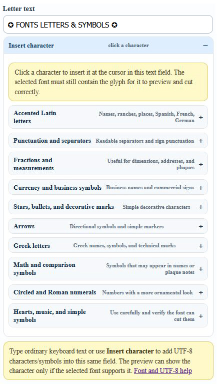
Need the full character reference? Open the lavender reference below for Unicode code points, printable characters, font-support notes, fabrication cautions, and grouped character tables.
The Letter text field accepts ordinary keyboard text and UTF-8 characters in the same field. The designer stores the real character, not an HTML entity.
U+00E9. That is usually what people mean when they ask for “UTF-8 hex.” True UTF-8 byte sequences are different, and are not usually helpful for entering gate lettering. Characters below U+0020 and other invisible/control characters are intentionally omitted.Peña RanchCafé 123No. 7 • East GateSmith & Co. ★
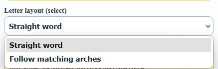
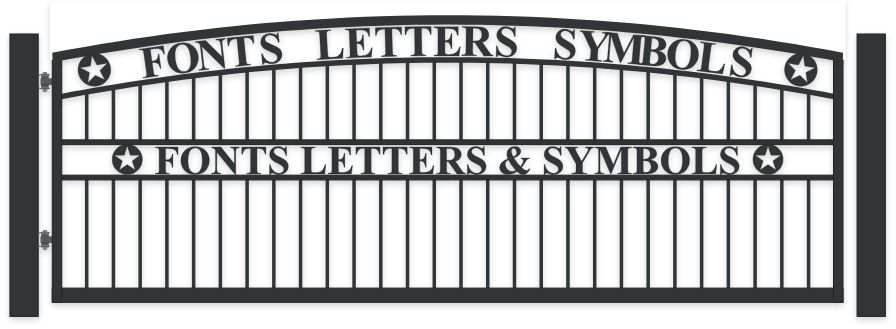
U+00C1ÁU+00C0ÀU+00C2ÂU+00C4ÄU+00C5ÅU+00C3ÃU+00C6ÆU+00C7ÇU+00C9ÉU+00C8ÈU+00CAÊU+00CBËU+00CDÍU+00CCÌU+00CEÎU+00CFÏU+00D1ÑU+00D3ÓU+00D2ÒU+00D4ÔU+00D6ÖU+00D5ÕU+00D8ØU+00DAÚU+00D9ÙU+00DBÛU+00DCÜU+00DDÝU+00E1áU+00E0àU+00E2âU+00E4äU+00E5åU+00E3ãU+00E6æU+00E7çU+00E9éU+00E8èU+00EAêU+00EBëU+00EDíU+00ECìU+00EEîU+00EFïU+00F1ñU+00F3óU+00F2òU+00F4ôU+00F6öU+00F5õU+00F8øU+00FAúU+00F9ùU+00FBûU+00FCüU+00FDýU+00FFÿU+00DFßU+0152ŒU+0153œU+2013–U+2014—U+2018‘U+2019’U+201C“U+201D”U+201A‚U+201E„U+2022•U+00B7·U+2026…U+2032′U+2033″U+00A7§U+00B6¶U+00A9©U+00AE®U+2122™U+2116№U+2044⁄U+00BC¼U+00BD½U+00BE¾U+215B⅛U+215C⅜U+215D⅝U+215E⅞U+00B0°U+00B1±U+00D7×U+00F7÷U+00B5µU+03A9ΩU+2030‰U+2031‱U+00A2¢U+00A3£U+00A5¥U+20AC€U+20BF₿U+20A9₩U+20B9₹U+00A4¤U+2120℠U+2105℅U+211E℞U+2605★U+2606☆U+2726✦U+2727✧U+2729✩U+272A✪U+2736✶U+2737✷U+2739✹U+273A✺U+273F✿U+2756❖U+25C6◆U+25C7◇U+25CF●U+25CB○U+25C9◉U+25A0■U+25A1□U+25B2▲U+25B3△U+25BC▼U+25BD▽U+2190←U+2191↑U+2192→U+2193↓U+2194↔U+2195↕U+2196↖U+2197↗U+2198↘U+2199↙U+21D2⇒U+21D0⇐U+21D4⇔U+2794➔U+279C➜U+27A4➤U+27A7➧U+0391ΑU+0392ΒU+0393ΓU+0394ΔU+0398ΘU+039BΛU+039EΞU+03A0ΠU+03A3ΣU+03A6ΦU+03B1αU+03B2βU+03B3γU+03B4δU+03B8θU+03BBλU+03C0πU+03C3σU+03C6φU+03C9ωU+2248≈U+2260≠U+2264≤U+2265≥U+221E∞U+2211∑U+221A√U+222B∫U+2206∆U+2202∂U+2234∴U+2235∵U+221D∝U+2205∅U+2460①U+2461②U+2462③U+2463④U+2464⑤U+2465⑥U+2466⑦U+2467⑧U+2468⑨U+2469⑩U+2160ⅠU+2161ⅡU+2162ⅢU+2163ⅣU+2164ⅤU+2165ⅥU+2166ⅦU+2167ⅧU+2168ⅨU+2169ⅩU+2665♥U+2661♡U+2663♣U+2666♦U+2660♠U+266A♪U+266B♫U+2600☀U+263E☾U+263C☼U+269C⚜U+271D✝U+2618☘U+2615☕Lettering can be arranged as a straight word or made to follow matching arches.
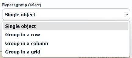
The same decorative object may remain a single object or be repeated as a row, column, or grid.
This example shows text following the upper arch and straight text across the middle of the gate.
Lettering and symbols can be used together as separate decorative objects, each with its own size and position.
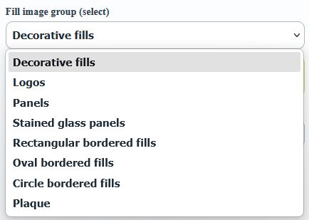
Then choose the image group:
After choosing the group, select the individual sample or stock image to place on the gate.
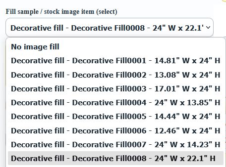
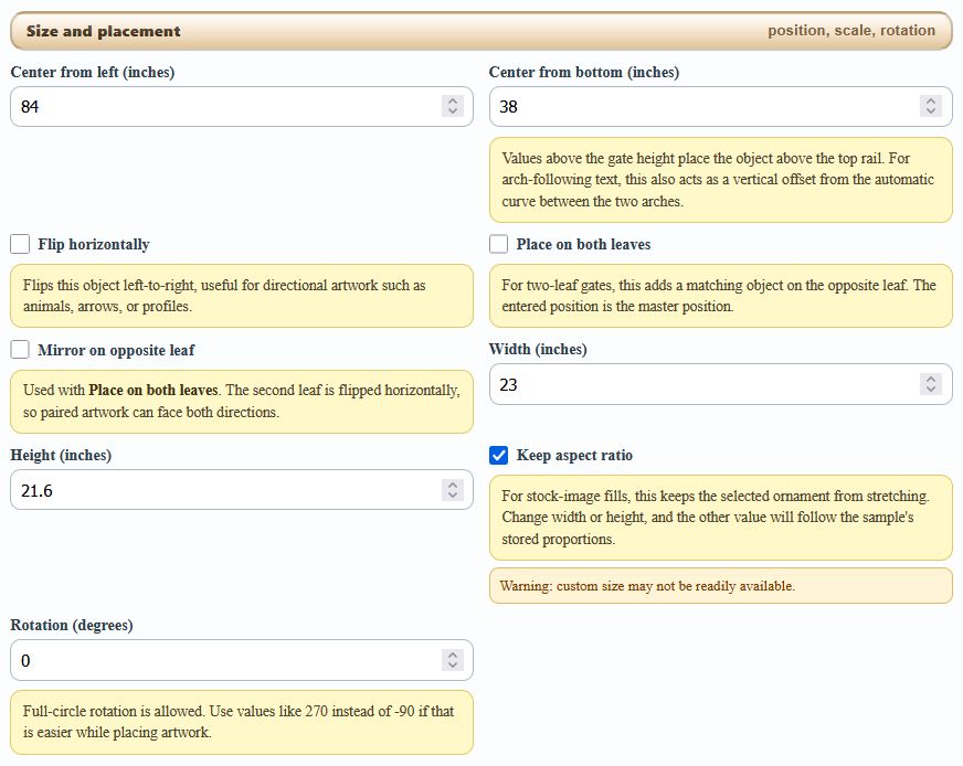
Set the object's center position from the left and from the bottom of the gate.
Then adjust width, height, rotation, horizontal flipping, both-leaf placement, or mirroring on the opposite leaf where appropriate.
These settings let the same stock image serve many different layouts without changing the original component file.
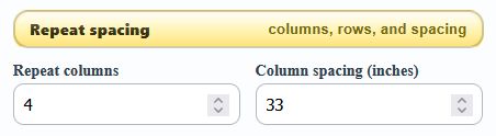
A decorative object may remain single or be repeated in a row, column, or grid.
When repeating, set the number of columns or rows and the spacing between them in inches.
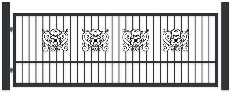
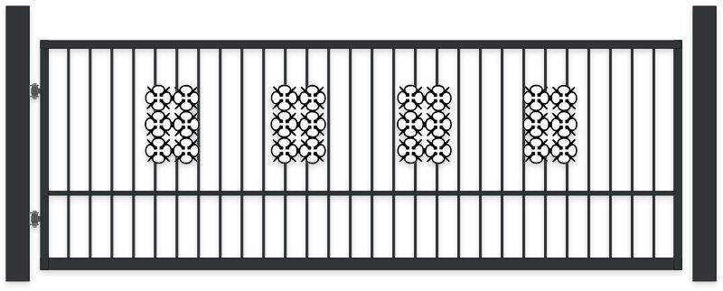
Decorative fills are ornamental image components that can be placed as single objects or repeated across the gate.
This example shows one decorative fill repeated four times in a row.
Logos can be placed and repeated like other image-based decorative objects.
Check the artwork carefully for fabrication practicality and for any small isolated details that may be difficult to cut or coat.
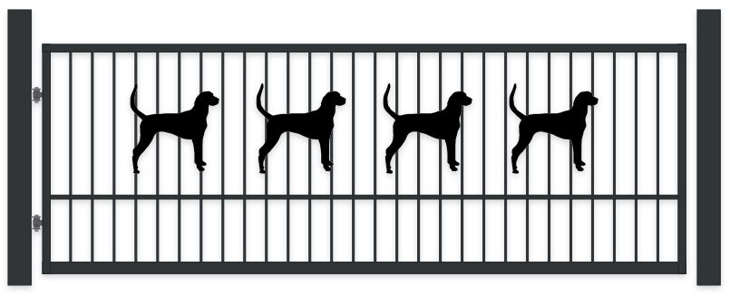
Panels are larger decorative image objects that can be placed within the gate structure and repeated when the design calls for matching inserts.
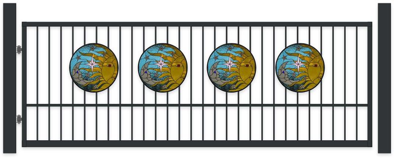
Stained glass panel images are useful for customer-facing visualization where a colored decorative insert is part of the concept.
Actual fabrication, glazing, framing, and attachment details should be confirmed separately.
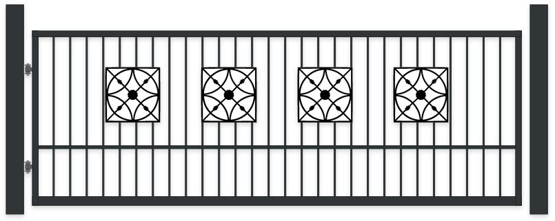
Bordered fills include a surrounding frame as part of the decorative object, helping the insert read as a self-contained panel.
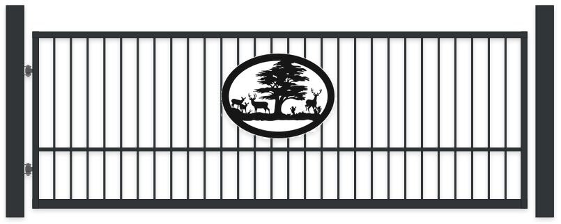
Oval bordered fills combine an ornamental image with its own oval frame and can be sized and positioned like other decorative objects.
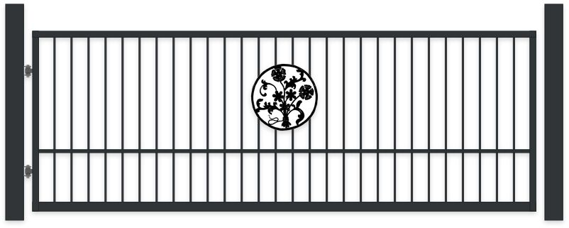
Circle bordered fills are round framed objects that can be placed singly or repeated depending on the design.
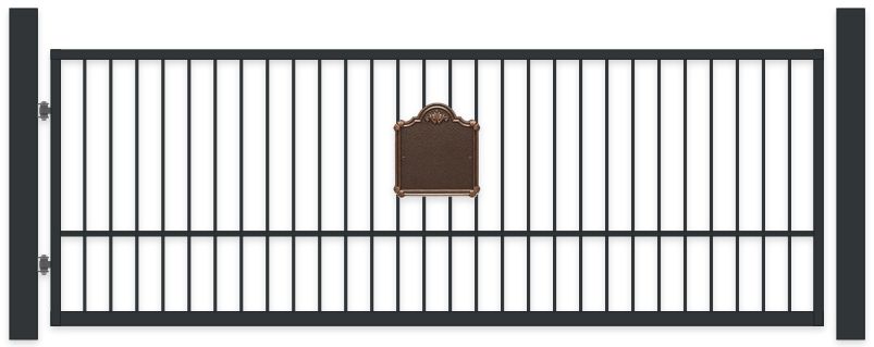
Plaques can be placed on the gate as decorative or informational elements and sized to suit the available space.
For actual plaque text, remember that multiple lines reduce the available letter height, so readability and fabrication practicality should be checked before final approval.
The Gate System Designer is a separate top-level area below Design a gate. Use it after the moving gate itself is established. It describes the installed environment around the gate rather than changing the ornamental frame, rails, fills, or lettering.
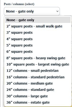
The support selector ranges from None — gate only through square steel posts and masonry columns. Height, masonry material, texture, scale, cap color, and cap rise refine the installed concept.
These opening supports are different from the required structural posts used by some slide-gate systems.
Cantilever gates use required carrier posts and rollers along the tail. Their visible post height is calculated from the gate, while optional entrance columns remain separate at the clear opening.
Upper-trolley gates use two structural support posts per leaf. V-track and bottom-trolley layouts use guide/support posts as required by their hardware.
The slide gate / guide-support side choice places the gate plane and supports on the outside, inside, or applicable side so the plan view can show the tail and columns without false overlap.
Cantilever carrier posts are not decorative entrance columns. Structural posts may be capped when exposed, and the technical packet carries their roller, bracket, foundation, and clearance information where applicable.
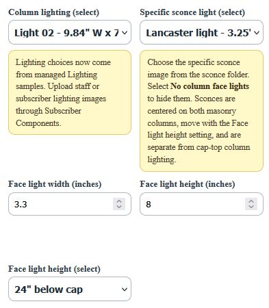
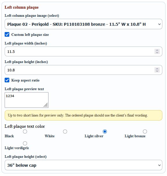
Post caps and top lights apply to suitable steel posts or entrance columns. Masonry columns can also use cap-top lighting, separate face sconces, and independently controlled left and right plaques.
Custom face-light and plaque sizes are presentation choices and should be verified against available products. Preserve conduit paths before posts or masonry are finished.
This is the first area under View a gate design. Use both straight-on elevations to check the visual result and the physical face of installed equipment before relying on the plan view or technical packet.
View from outside gate — street / ingress side is the reference for left/right handing, hinge side, and many component selectors.
View from inside gate — property side mirrors the gate and shows the opposite physical face. Hinges, photo-eyes, locks, KNOX equipment, fire-strobe pipe, columns, and other items are layered according to the selected gate movement and support face.
These are elevations, not perspective drawings. An in/out offset may determine whether an object is in front of or behind a post in an elevation, but the proportional plan view is used to understand the actual depth relationship.
Use the summary information below the preview to verify the gate type, frame sizes, rails, mullions, pickets, sections, fills, calculated spacing, and warnings.
This area turns the current gate and Gate System selections into printable technical documentation. The main gate fabrication drawing comes first, followed by materials, selected components, proportional plan view, hinge or slide-support details, installation references, and fabricator notes where applicable.
The packet may include the main gate fabrication drawing, materials and selected components, section and fill notes, proportional plan view, masonry or post references, CI3000 hinge details, guide-roller details, slide-gate layouts, field installation details, and general fabricator notes.
The sheets shown depend on the selected gate type and the options used in the design.
Opening width can mean different things to different people. A client usually thinks of the driveway clear passage they want when the gate is fully open. A designer may be thinking about the space between posts or columns. An installer may be deciding whether post holes go beside the driveway, partly notched into the driveway edge, or set back from the driveway edge.
Gate dimensions in the designer are actual gate dimensions. The gate width and gate height used for the design describe the physical moving gate leaf or leaves, not automatically the full driveway clear opening after posts, columns, hinges, reveals, operators, or hardware are accounted for.
On swing gates, hinges are commonly placed between the post and gate with a reveal such as 3". When the gate opens, the gate thickness and hinge hardware can still project into the usable passage. For example, a 120" driveway may need posts set back or outside the driveway edge so the open gate still leaves the desired 120" of clear passage.
Best practice: agree on the desired clear driveway passage, post or column placement, hinge/reveal assumptions, and ground conditions before digging. For production work, wait until the posts or columns are set and the actual post-to-post distance is measured before ordering or fabricating the final gate leaf width.
This area sends the current design as shown now for pricing. It can include edits that have not yet been saved as a gate packet.
This is the final area under View a gate design. Complete Fabrication drawing info first, then choose the kind of record or output needed.
gate_units/ directory.
 Finial 01
finial0001
Finial 01
finial0001
 Finial 03
finial0003
Finial 03
finial0003
 Finial 04
finial0004
Finial 04
finial0004
 Finial 05
finial0005
Finial 05
finial0005
 Finial 06
finial0006
Finial 06
finial0006
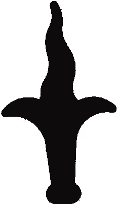 Finial 07
finial0007
Finial 07
finial0007
 Cap 01
cap0001
Cap 01
cap0001
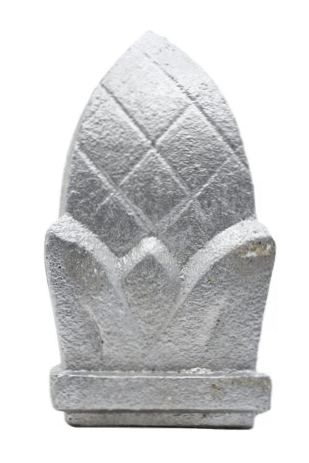 Cap 02
cap0002
Cap 02
cap0002
 Cap 03
cap0003
Cap 03
cap0003
 Cap 04
cap0004
Cap 04
cap0004
 Cap 05
cap0005_6_2.125_1782762823317
Cap 05
cap0005_6_2.125_1782762823317
 Cap 07
cap0007_3_1.063_1783370709580
Cap 07
cap0007_3_1.063_1783370709580
 Cap 08
cap0008_2_1_1783370858161
Cap 08
cap0008_2_1_1783370858161
 Cap 09
cap0009_4_1.625_1783371000527
Cap 09
cap0009_4_1.625_1783371000527
 Knuckle 04
knuckle0004_0.675_0.675_1782437389178
Knuckle 04
knuckle0004_0.675_0.675_1782437389178
 Knuckle 06
knuckle0006_0.25_1.75_1782438206513
Knuckle 06
knuckle0006_0.25_1.75_1782438206513
 Knuckle 07
knuckle0007_0.75_1.75_1782438318974
Knuckle 07
knuckle0007_0.75_1.75_1782438318974
 Knuckle 7326
scan_08ab5c124a9a_0.5_0.75_1782437107326
Knuckle 7326
scan_08ab5c124a9a_0.5_0.75_1782437107326
 Knuckle 7045
scan_6cbe30c531bc_0.5_0.075_1782436157045
Knuckle 7045
scan_6cbe30c531bc_0.5_0.075_1782436157045
 Knuckle 9611
scan_449e6c0cb653_1_2.5_1782438009611
Knuckle 9611
scan_449e6c0cb653_1_2.5_1782438009611
 Baluster 02
baluster0002_0.5_45.25_1782363990942
Baluster 02
baluster0002_0.5_45.25_1782363990942
 Baluster 03
baluster0003_0.5_45.25_1782363990942
Baluster 03
baluster0003_0.5_45.25_1782363990942
 Band fill 06
band fill · 44-30-12S · 3.5 x 3.5
Band fill 06
band fill · 44-30-12S · 3.5 x 3.5
 Band fill 07
band fill · 13-10042-101 · 3-15/16 x 3-15/16
Band fill 07
band fill · 13-10042-101 · 3-15/16 x 3-15/16
 Band fill 08
band fill · 13-10042-102 · 3.94 x 3.94
Band fill 08
band fill · 13-10042-102 · 3.94 x 3.94
 Band fill 01
band fill · 13-20024-590 · 4-15/16 x 8-7/16
Band fill 01
band fill · 13-20024-590 · 4-15/16 x 8-7/16
 Band fill 10
band fill · 13-31024-371 · 2.69 x 3.94
Band fill 10
band fill · 13-31024-371 · 2.69 x 3.94
 Band fill 11
band fill · 13-10042-321 · 3.94 x 9.063
Band fill 11
band fill · 13-10042-321 · 3.94 x 9.063
 Band fill 05
s scroll · 13-80-A11 · 2-9/16 x 5-7/8
Band fill 05
s scroll · 13-80-A11 · 2-9/16 x 5-7/8
 Mesh 01
mesh0001
Mesh 01
mesh0001
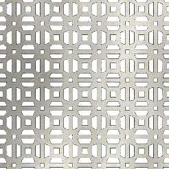 Mesh 02
mesh0002
Mesh 02
mesh0002
 Mesh 03
mesh0003
Mesh 03
mesh0003
 Mesh 04
mesh0004
Mesh 04
mesh0004
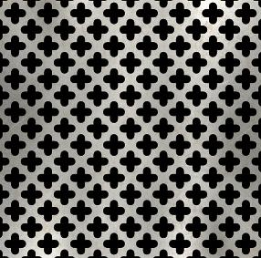 Mesh 05
mesh0005
Mesh 05
mesh0005
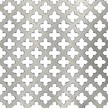 Mesh 06
mesh0006
Mesh 06
mesh0006
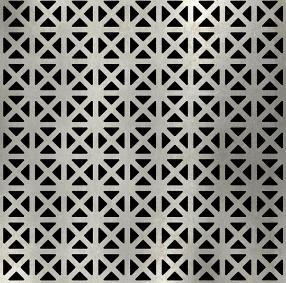 Mesh 07
mesh0007
Mesh 07
mesh0007
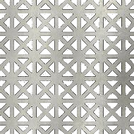 Mesh 08
mesh0008
Mesh 08
mesh0008
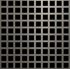 Mesh 09
mesh0009
Mesh 09
mesh0009
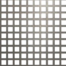 Mesh 10
mesh0010
Mesh 10
mesh0010
 Mesh 11
mesh0011
Mesh 11
mesh0011
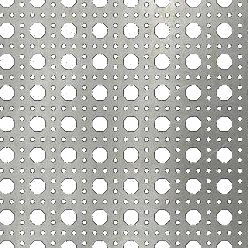 Mesh 12
mesh0012
Mesh 12
mesh0012
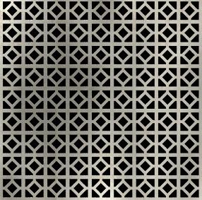 Mesh 13
mesh0013
Mesh 13
mesh0013
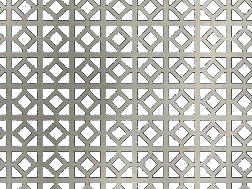 Mesh 14
mesh0014
Mesh 14
mesh0014
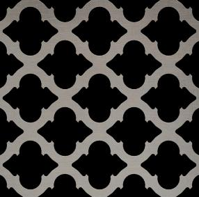 Mesh 15
mesh0015
Mesh 15
mesh0015
 Mesh 16
mesh0016
Mesh 16
mesh0016
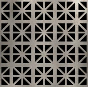 Mesh 17
mesh0017
Mesh 17
mesh0017
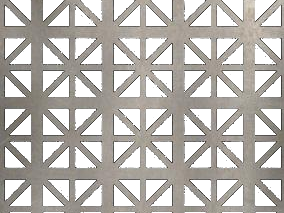 Mesh 18
mesh0018
Mesh 18
mesh0018
 Mesh 19
mesh0019
Mesh 19
mesh0019
 Mesh 20
mesh0020
Mesh 20
mesh0020
Mesh images are read directly from images/artistic_components/mesh. Use the Gate Designer mesh scale control to adjust apparent opening size until each pattern has measured metadata.
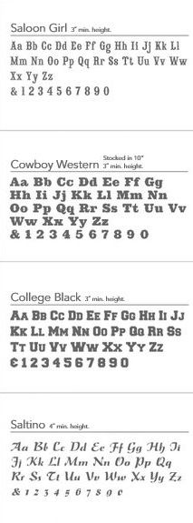
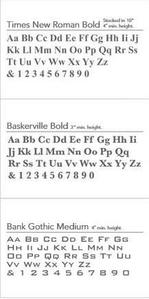
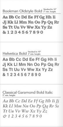
Managed font files used for custom cut letters. These can be used by Gate Designer for a more accurate visual preview once the font loader is connected.
Fonts are grouped by supplier when supplier information is available. Fonts without supplier information are shown under Common fonts.

 Decorative fill 01
decorative_fill0001
Decorative fill 01
decorative_fill0001
 Decorative fill 02
decorative_fill0002
Decorative fill 02
decorative_fill0002
 Decorative fill 03
decorative_fill0003
Decorative fill 03
decorative_fill0003
 Decorative fill 04
decorative_fill0004
Decorative fill 04
decorative_fill0004
 Decorative fill 05
decorative_fill0005
Decorative fill 05
decorative_fill0005
 Decorative fill 06
decorative_fill0006
Decorative fill 06
decorative_fill0006
 Decorative fill 07
decorative_fill0007
Decorative fill 07
decorative_fill0007
 Decorative fill 08
decorative_fill0008
Decorative fill 08
decorative_fill0008
 Decorative fill 09
decorative_fill0009
Decorative fill 09
decorative_fill0009
 Decorative fill 10
decorative_fill0010
Decorative fill 10
decorative_fill0010
 Decorative fill 11
decorative_fill0011
Decorative fill 11
decorative_fill0011
 Decorative fill 12
decorative_fill0012
Decorative fill 12
decorative_fill0012
 Decorative fill 13
decorative_fill0013
Decorative fill 13
decorative_fill0013
 Decorative fill 15
decorative_fill0015
Decorative fill 15
decorative_fill0015
 Decorative fill 16
decorative_fill0016
Decorative fill 16
decorative_fill0016
 Decorative fill 17
decorative_fill0017
Decorative fill 17
decorative_fill0017
 Decorative fill 18
decorative_fill0018
Decorative fill 18
decorative_fill0018
 Decorative fill 19
decorative_fill0019
Decorative fill 19
decorative_fill0019
 Decorative fill 20
decorative_fill0020
Decorative fill 20
decorative_fill0020
 Decorative fill 21
decorative_fill0021
Decorative fill 21
decorative_fill0021
 Decorative fill 22
decorative_fill0022
Decorative fill 22
decorative_fill0022
 Decorative fill 23
decorative_fill0023
Decorative fill 23
decorative_fill0023
 Decorative fill 24
decorative_fill0024
Decorative fill 24
decorative_fill0024
 Decorative fill 25
decorative_fill0025
Decorative fill 25
decorative_fill0025
 Decorative fill 26
decorative_fill0026
Decorative fill 26
decorative_fill0026
 Decorative fill 27
decorative_fill0027
Decorative fill 27
decorative_fill0027
 Decorative fill 28
decorative_fill0028
Decorative fill 28
decorative_fill0028
 Decorative fill 29
decorative_fill0029
Decorative fill 29
decorative_fill0029
 Decorative fill 30
decorative_fill0030
Decorative fill 30
decorative_fill0030
 Decorative fill 31
decorative_fill0031
Decorative fill 31
decorative_fill0031
 Logo 02
logo0002
Logo 02
logo0002
 Logo 04
logo0004
Logo 04
logo0004
 Logo 07
logo0007
Logo 07
logo0007
 Logo 11
logo0011
Logo 11
logo0011
 Panel 01
panel0001
Panel 01
panel0001
 Panel 02
panel0002
Panel 02
panel0002
 Panel 03
panel0003
Panel 03
panel0003
 Panel 04
panel0004
Panel 04
panel0004
 Panel 07
panel0007
Panel 07
panel0007
 Panel 09
panel0009
Panel 09
panel0009
 Panel 10
panel0010
Panel 10
panel0010
 Panel 10
panel0010_mask - Copy
Panel 10
panel0010_mask - Copy
 Panel 11
panel0011
Panel 11
panel0011
 Panel 14
panel0014
Panel 14
panel0014
 Panel 15
panel0015
Panel 15
panel0015
 Panel 15
panel0015_mask - Copy
Panel 15
panel0015_mask - Copy
 Panel 17
panel0017
Panel 17
panel0017
 Panel 18
panel0018
Panel 18
panel0018
 Stained glass panel 14
10014_24_24
Stained glass panel 14
10014_24_24
 Stained glass panel 5982
125982_22_22
Stained glass panel 5982
125982_22_22
Stained glass panels are read from images/artistic_components/panels/glass and remain part of the Panels family.
 Rectangular bordered fill 05
panel0005
Rectangular bordered fill 05
panel0005
 Rectangular bordered fill 06
panel0006
Rectangular bordered fill 06
panel0006
 Rectangular bordered fill 08
panel0008
Rectangular bordered fill 08
panel0008
 Rectangular bordered fill 12
panel0012
Rectangular bordered fill 12
panel0012
 Rectangular bordered fill 13
panel0013
Rectangular bordered fill 13
panel0013
 Oval bordered fill 05
logo0005
Oval bordered fill 05
logo0005
 Oval bordered fill 06
logo0006
Oval bordered fill 06
logo0006
 Oval bordered fill 08
logo0008
Oval bordered fill 08
logo0008
 Oval bordered fill 09
logo0009
Oval bordered fill 09
logo0009
 Oval bordered fill 10
logo0010
Oval bordered fill 10
logo0010
 Circle bordered fill 14
decorative_fill0014
Circle bordered fill 14
decorative_fill0014
 Circle bordered fill 01
logo0001
Circle bordered fill 01
logo0001
 Circle bordered fill 03
logo0003
Circle bordered fill 03
logo0003
Styles are the two vertical ends of the gate. Mullions are optional vertical pieces between them. The open bays between styles and mullions are kept equal, and pickets are spaced within each bay.
This sends the current design as shown now, including unsaved edits, to the company responsible for the design. A subscriber-gallery design is routed back to that subscriber; Autogate NW stock designs and new visitor designs are routed to Autogate NW.
The next page asks for your contact and project information. The complete gate-design JSON and a preview image are included with the request.
Visitor preview: These sheets remain visible as samples, but downloads, Save-to-PDF helpers, and server-side saving are disabled for visitors.
Server save unavailable in visitor preview: Visitors can view the sheets, but saving is reserved for clients, subscribers, and administration.
Gate professionals who try the designer and complete the short feedback survey within 60 days can receive an additional month of free access.
Take the feedback survey